
UI OKIKE STUDIO
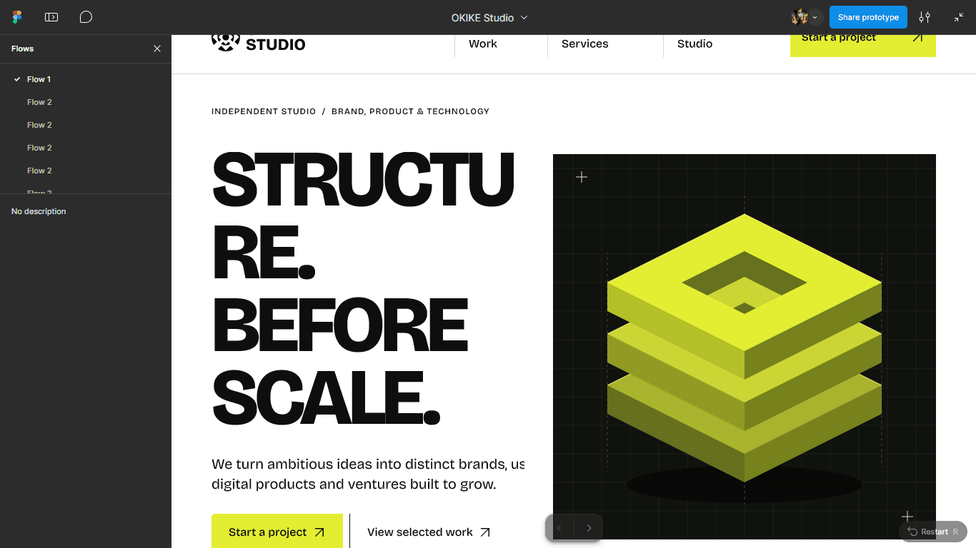
Complete Figma design system, responsive grid architecture, and interactive prototype.
The visual blueprint powering OKIKE Studio across desktop, tablet, and mobile.
FIGMA UI CASE STUDY · OKIKE STUDIO
01 / THE BRIEF
- CLIENT
- OKIKE Studio
- SECTOR
- Design Systems & UI Architecture
- SCOPE
- UI/UX Design, Responsive Breakpoints, Interactive Prototype
- YEAR
- 2026
The question
behind the work.
Scaling a studio platform across marketing pages, multi-step enquiry flows, admin CMS views, and client dashboards requires strict visual consistency.
Establish a modular Figma component library and token system before writing a single line of production CSS.
02 / THE DESIGN DIRECTION
One idea.
A complete system.
Swiss-inspired grid discipline, high-contrast surface hierarchy, and reusable auto-layout components calibrated for both light editorial pages and dark portal workspaces.
02A / TYPOGRAPHIC ARCHITECTURE
Aa
01—09
02B / DESIGN TOKENS & SYSTEM
FORM.
FUNCTION.
03 / IN USE & INTERFACE
Built for the
people using it.
Every screen—from hero compositions to mobile navigation drawers and pricing cards—was prototyped and stress-tested in Figma for rapid engineering handoff.
04 / THE OUTCOME
What changed.
Delivered an end-to-end Figma master file with zero visual drift between design and Next.js implementation.
Explore the interactive Figma file directly below.