
UI BRANDORAX
Brand identity direction and digital interface design crafted in Figma.
Giving a modern brand platform a sharp, unmistakable visual language.
BRAND & FIGMA CASE STUDY · OKIKE STUDIO
01 / THE BRIEF
- CLIENT
- Brandorax
- SECTOR
- Brand & Digital Platform
- SCOPE
- Brand Identity, UI/UX Design, Figma Prototype
- YEAR
- 2026
The question
behind the work.
Brandorax needed a visual identity and web interface that communicated authority, clarity, and contemporary craft without clutter.
Design a cohesive identity system and interactive Figma interface prototype ready for full-stack buildout.
02 / THE DESIGN DIRECTION
One idea.
A complete system.
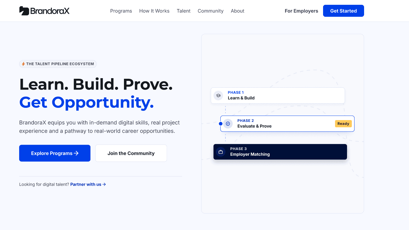
Bold typographic hierarchy paired with balanced negative space, structured cards, and crisp brand accents across key user touchpoints.
02A / TYPOGRAPHIC ARCHITECTURE
Aa
01—09
02B / DESIGN TOKENS & SYSTEM
FORM.
FUNCTION.
03 / IN USE & INTERFACE
Built for the
people using it.
Designed in Figma with modular layout sections, clear call-to-action flows, and responsive screen specs for seamless developer execution.
04 / THE OUTCOME
What changed.
Delivered a complete brand-to-UI system in Figma with reusable components and layout specs.
Interactive Figma design file embedded below.