
LYDIA DIARIES
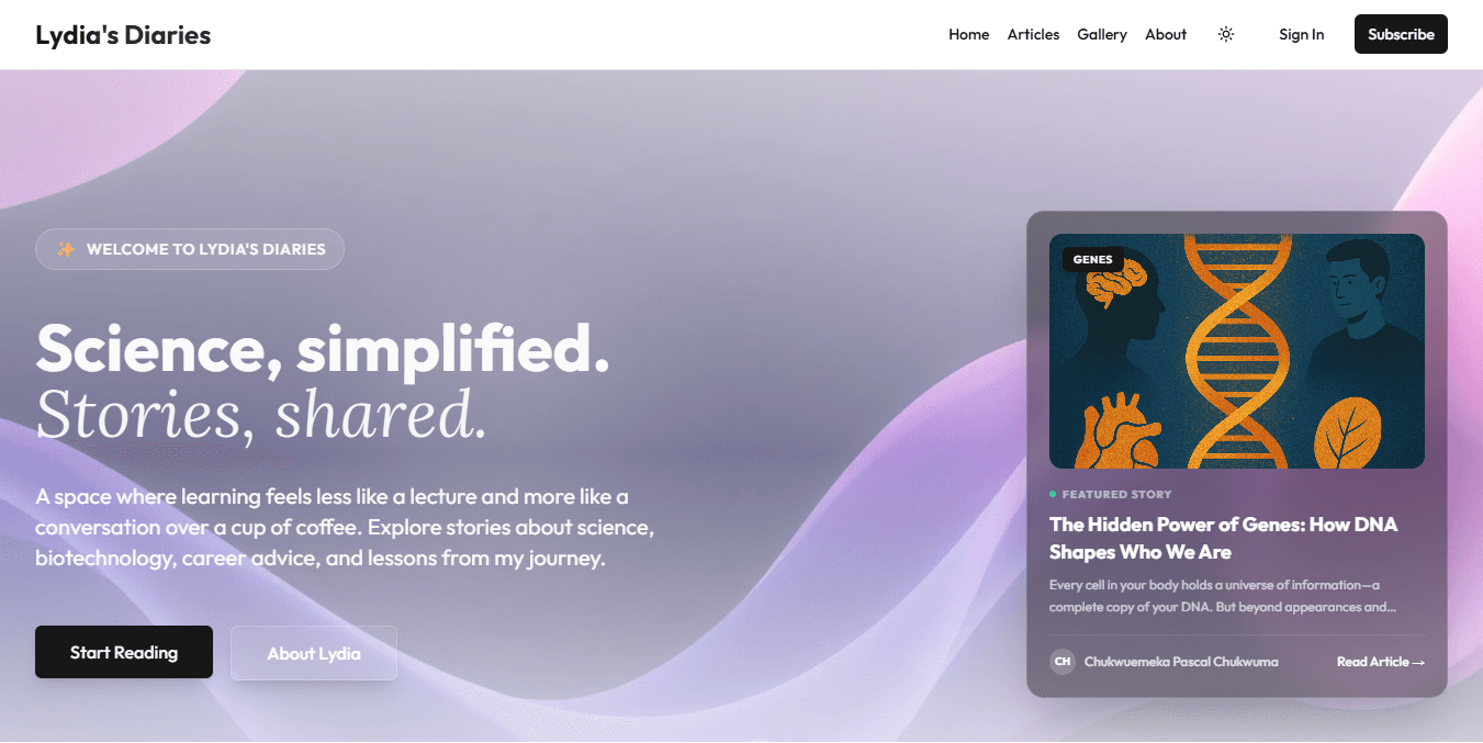
An editorial space where learning feels like a conversation over a cup of coffee.
Built to welcome curiosity and make thoughtful stories effortless to read.
SELECTED CASE STUDY · OKIKE STUDIO
01 / THE BRIEF
- CLIENT
- LYDIA DIARIES
- SECTOR
- Editorial Media & Learning
- SCOPE
- Brand Aesthetic, Editorial UI, Web Implementation
- YEAR
- 2026
The question
behind the work.
Educational content platforms often feel rigid and academic, creating distance between the writer and the reader.
Craft a warm, conversational digital publication that encourages deep reading and community curiosity.
02 / THE DESIGN DIRECTION
One idea.
A complete system.
Soft tonal balance, readable long-form typography, and distraction-free article layouts designed for comfort across devices.
02A / TYPOGRAPHIC ARCHITECTURE
Aa
01—09
02B / DESIGN TOKENS & SYSTEM
FORM.
FUNCTION.
03 / IN USE & INTERFACE
Built for the
people using it.
Readers explore essays and learning series in an intuitive, calm browsing flow with fast page loads.
03A / INTERACTIVE FLAGSHIP ARCHITECTURE
A clear idea.
Made tangible.
LYDIA DIARIES · Brand Aesthetic, Editorial UI, Web Implementation
04 / THE OUTCOME
What changed.
Launched a distinct editorial web presence at lydiadiaries.com.
Live platform at https://www.lydiadiaries.com